Thesis and Further Analysis
We continue our analysis by looking at all different factors that could have a correlation with each other. While we initially started with air quality vs population to check if there were any regions or subregions within continents that have a specific trend, we wanted to continue this analysis with other indicators such as GDP, water quality, urban population, and slum population to what we believe would be our response variable of disbursements. We did not want to be naive with our analysis, as it would be easy to assume that a higher population generally tends towards a worse air quality, so we are looking at different ways to approach our analysis, looking at different time stamps to see if there were any changes between the years.
Our three tentative theses after considering the analyses we will further do is:
- The amount of aid a country obtains does not necessarily translate to better quality or access to basic needs such as water, sanitation, and electricity of the population.
- The greater access to one necessity does not necessarily imply the same level or a greater accessibility to another variable (e.g. access to phone does not imply access to water), considering the level of disbursement the country obtains.
- As time goes on, we see the accessibility a country has to basic necessities increase since there is a time lag as to when the disbursements are accepted and it being put to use.
Visualization
For our final project, our plan of visualization would be to present multiple plots of, firstly, the main relationship we are investigating. This would then include different ways to sort and add or take away control variables that may impact the response variable. In the said plot, there would also be colors in order to help users identify the data according to the categories that they have chosen to sort the data through. We will also be adding several other plots of relationships that are of interest in our exploratory data analysis and that also relates to the overall big-picture model we are looking at. On top of this, we may also include several tables including the significant summary statistics or data that will communicate important information we would like the user to know when using our interactive platform. We may also include a map of the world map as an interactive in order to not only have the users be able to better visualize the data on certain variables, such as population, but also as a sort of “break” from the other more “traditional” figures that we may have, including dot or line plots.
Data Exploration
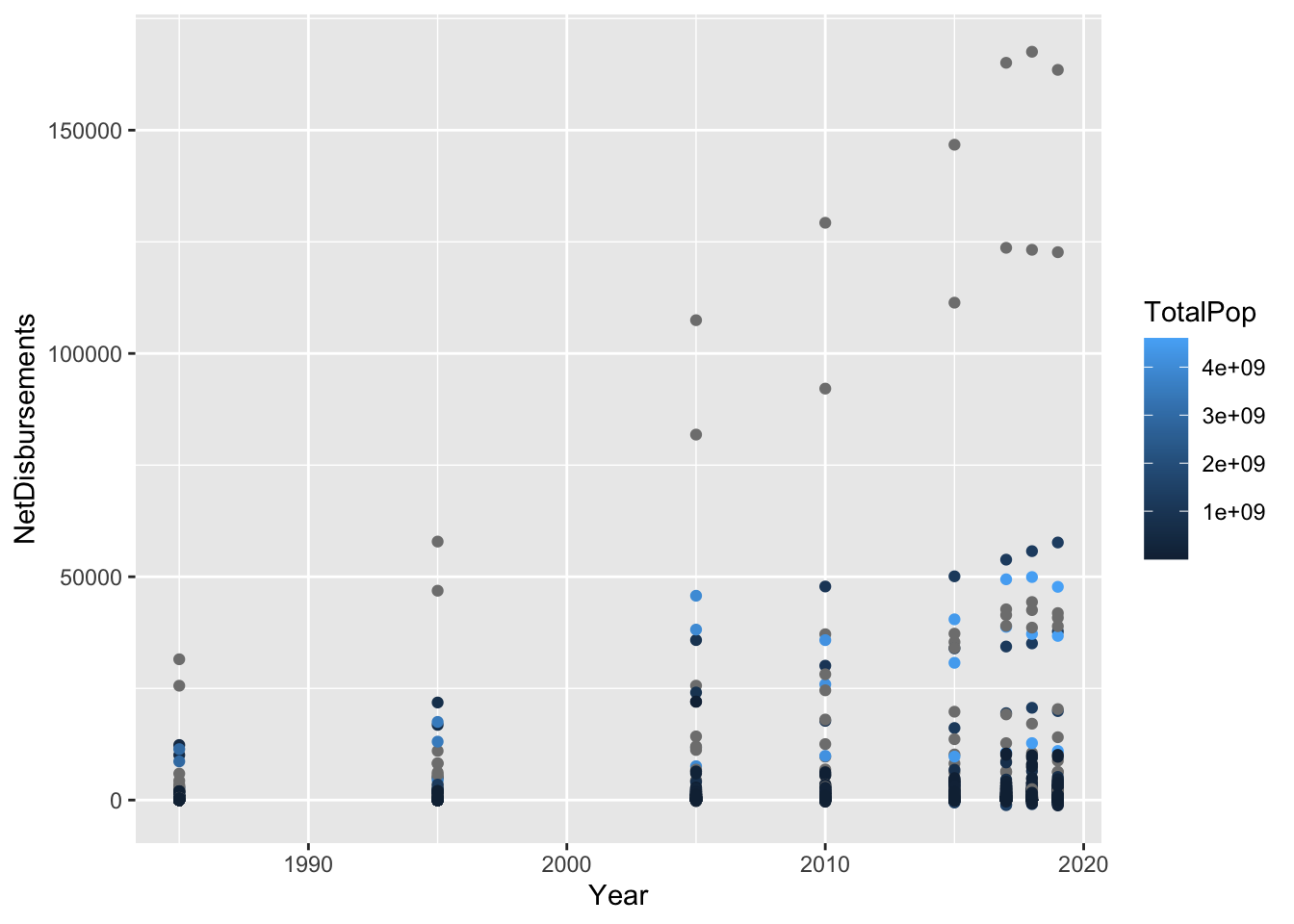
There appears in the graph below to be a correlation between year and net disbursement of aid. However, much of our data is too incomplete to create a linear model with many possible predictors, because the data are available for different years. As a result, we will have to look at individual predictors ability to predict net disbursement, in combination with population data which is relatively compelte, and ideally we will find additional data to incorporate which will create a more complete picture in our analysis. Preliminarily, the percentage of slum population and the total population are predictors of net aid disbursement, with higher percentage slum and higher population predicting higher net aid disbursement.
mod <- lm(NetDisbursements ~ Year + PercUrban + PercSlum + TotalPop, data = joined, na.action=na.omit)
summary(mod)
##
## Call:
## lm(formula = NetDisbursements ~ Year + PercUrban + PercSlum +
## TotalPop, data = joined, na.action = na.omit)
##
## Residuals:
## Min 1Q Median 3Q Max
## -1595.1 -466.6 -195.6 99.3 21124.3
##
## Coefficients:
## Estimate Std. Error t value Pr(>|t|)
## (Intercept) -2.199e+04 6.237e+04 -0.353 0.72460
## Year 1.096e+01 3.108e+01 0.353 0.72460
## PercUrban -1.873e+02 3.990e+02 -0.469 0.63896
## PercSlum 2.889e+03 8.975e+02 3.219 0.00138 **
## TotalPop 1.099e-06 4.740e-07 2.318 0.02090 *
## ---
## Signif. codes: 0 '***' 0.001 '**' 0.01 '*' 0.05 '.' 0.1 ' ' 1
##
## Residual standard error: 1589 on 433 degrees of freedom
## (4515 observations deleted due to missingness)
## Multiple R-squared: 0.03191, Adjusted R-squared: 0.02297
## F-statistic: 3.568 on 4 and 433 DF, p-value: 0.007062joined %>%
ggplot() + geom_point(aes(x = Year, y = NetDisbursements, color = TotalPop))