Load Datasets
load("population.RData")
load("slum_population.RData")
load("public_transport.RData")
load("services.RData")
load("land_consumption.RData")
load("air_q_by_c.RData")
slums <- read_csv("slum_percent.csv")
services <- read_csv("access_basic_services.csv")
popgrowth <- read_csv("PopGrowth.csv")
slums_and_services <- left_join(slums, services, by = c("Country or Area" = "County"))
demog <- left_join(slums_and_services, popgrowth, by = "Country or Area")
Demog <- demog[ c(1) ]
demog$Pop_Growth_Percent = as.numeric(as.character(demog$Pop_Growth_Percent))slum_pop_reg <- lm(slum_2018 ~ Pop_Growth_Percent, data = demog)
summary(slum_pop_reg)##
## Call:
## lm(formula = slum_2018 ~ Pop_Growth_Percent, data = demog)
##
## Residuals:
## Min 1Q Median 3Q Max
## -41.577 -15.074 1.275 12.342 56.343
##
## Coefficients:
## Estimate Std. Error t value Pr(>|t|)
## (Intercept) 13.8538 2.3107 5.996 4.8e-09 ***
## Pop_Growth_Percent 8.3344 0.6809 12.241 < 2e-16 ***
## ---
## Signif. codes: 0 '***' 0.001 '**' 0.01 '*' 0.05 '.' 0.1 ' ' 1
##
## Residual standard error: 18.34 on 372 degrees of freedom
## (125 observations deleted due to missingness)
## Multiple R-squared: 0.2871, Adjusted R-squared: 0.2852
## F-statistic: 149.8 on 1 and 372 DF, p-value: < 2.2e-16(sp_coef <- coef(slum_pop_reg))## (Intercept) Pop_Growth_Percent
## 13.853761 8.334379ggplot(demog, aes(Pop_Growth_Percent, slum_2018)) +
geom_point(alpha = .3) +
geom_abline(intercept = sp_coef[1], slope = sp_coef[2], color = "red") +
xlab("Population Growth (%)") + ylab("Population living in slums (%)") +
ggtitle("Slum Population vs Population Growth")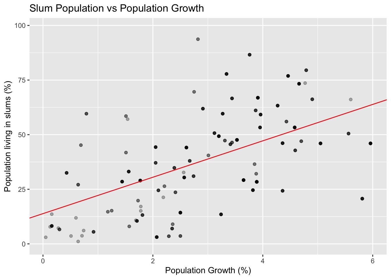 In this example, we modeled the effect of a country’s population growth by percentage from 2010-2015 with the percentage of their population living in slums (as defined by the United Nations) in 2018. We chose the percentage of a population living in slums as our response variable in order to see how certain predictor variables can negatively affect vulnerable populations. In this case, we selected population growth as a predictor variable in order to determine how responsible the sheer number of people living in an area is for overcrowding and a poor standard of living. In other words, we want to see if nations with high portions of their population living in slums can point to high population growth as a factor.
To do this, we modeled the effect of population growth on slum populations as a percentage both using both a linear regression model (included here) and a logistic regression model (omitted). In order to create these models, we needed to convert the population growth column to a numeric value, since R initially thought the percentages were categorical. We decided upon the linear regression model since both the linear and logistic regression models show approximately the same relationship: that population growth and slum population as a percentage of national population are directly correlated, though not 1:1. The relationship is, however, strongly statistically significant, with p < 10E-15. Put more simply, people living in slums may have something to do with population growth, but that doesn’t tell the entire story.
Air Quality and Population
The dataset pop_air combines air quality data and urban population data in 2015 for countries found in both datasets.
pop_air <- inner_join(air_quality_by_country %>% pivot_longer(cols = matches("[0-9]{4}"), names_to = "Year", values_to = "Quality"), urban_pop %>% pivot_longer(cols = matches("[0-9]{4}"), names_to = "Year", values_to = "Population"), by = c("Country" = "Region, subregion, country or area", "Year"))The linear model below shows that urban population is a significant predictor of air quality, with a p-value < 0.05. However, the adjusted R squared is 0.0259, meaning urban population only explains 2.59% of the variation in air quality. It is unclear whether these variables are only correlated, or whether having a greater urban population actually contributes to worse air quality.
mod_pop_air <- lm(Quality ~ Population, data = pop_air)
summary(mod_pop_air)
##
## Call:
## lm(formula = Quality ~ Population, data = pop_air)
##
## Residuals:
## Min 1Q Median 3Q Max
## -29.525 -14.555 -5.740 7.995 64.324
##
## Coefficients:
## Estimate Std. Error t value Pr(>|t|)
## (Intercept) 2.474e+01 1.463e+00 16.909 <2e-16 ***
## Population 8.770e-05 3.593e-05 2.441 0.0156 *
## ---
## Signif. codes: 0 '***' 0.001 '**' 0.01 '*' 0.05 '.' 0.1 ' ' 1
##
## Residual standard error: 18.89 on 185 degrees of freedom
## (2 observations deleted due to missingness)
## Multiple R-squared: 0.0312, Adjusted R-squared: 0.02596
## F-statistic: 5.958 on 1 and 185 DF, p-value: 0.01559Since the population and air quality values are not on the same scale, log transforming population makes the trend more easy to see. There is clearly an upward trend in air_quality index with increasing population for some countries, which supports the idea that an increased urban population is correlated with a worse air quality index. However, the linear model line, while significant, is nearly horizontal because \(\beta_1\) (slope) is so small.
pop_air %>%
  ggplot() + geom_point(aes(x = log(Population), y = Quality)) +
  labs(title = "Urban Population vs. Air Quality Index 2015", x = "log(Urban Population)",
       y = "Air Quality Score") + geom_abline(intercept = coef(mod_pop_air)[1], slope = coef(mod_pop_air)[2], color = "red")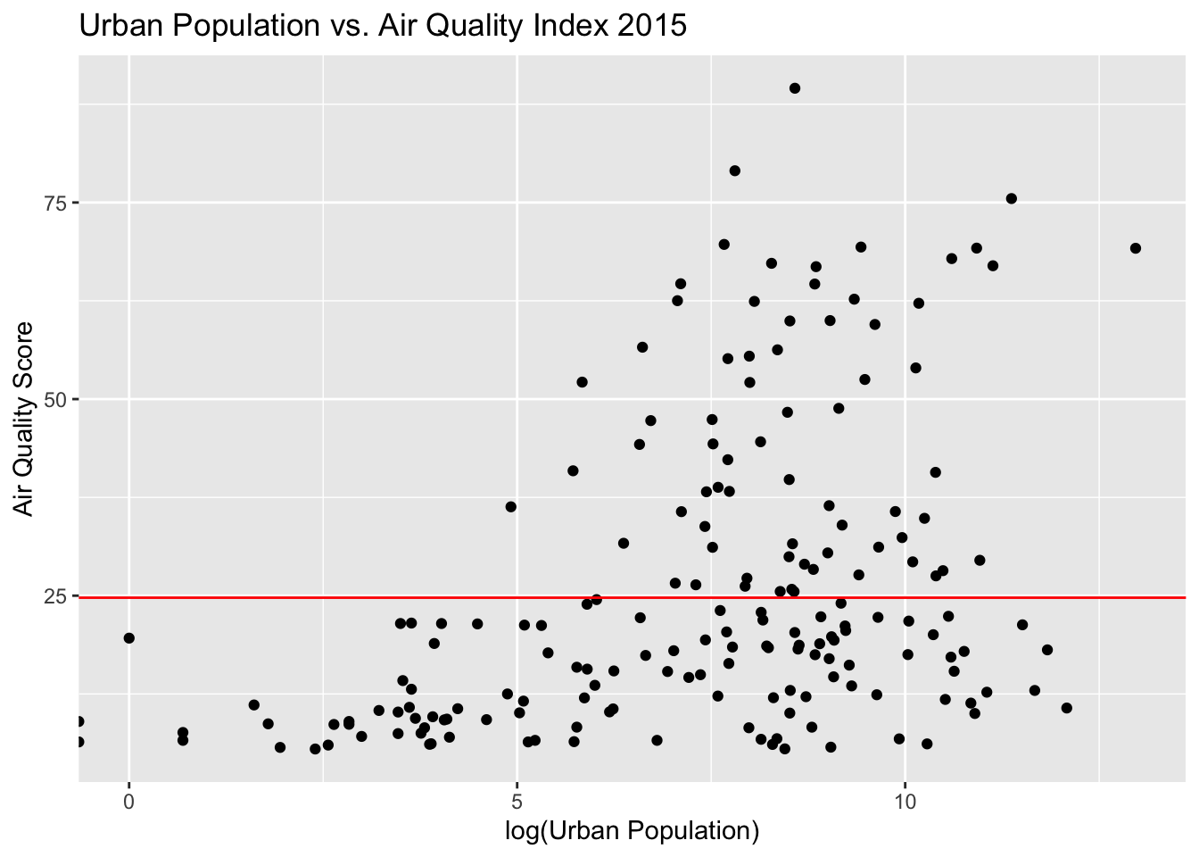
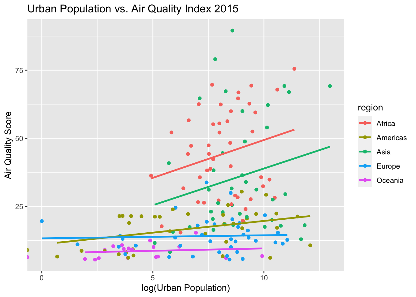
This data can be joined with regional data to determine whether region is a significant predictor of air quality. The model with region included along with population is a much better predictor of air quality (p < 2.23-16, region predictors all significant at more stringent threshold than Population), and explains 50.4% of the variation in air quality score (adjusted R-squared).
country_info <- read_csv("https://raw.githubusercontent.com/lukes/ISO-3166-Countries-with-Regional-Codes/master/all/all.csv")

pop_air_extended <- inner_join(pop_air, country_info %>% select("name", "region", "sub-region"), c("Country" = "name"))

mod_extended <- lm(Quality ~ Population + region, data = pop_air_extended)
summary(mod_extended)
##
## Call:
## lm(formula = Quality ~ Population + region, data = pop_air_extended)
##
## Residuals:
## Min 1Q Median 3Q Max
## -28.416 -8.073 -0.840 5.641 55.160
##
## Coefficients:
## Estimate Std. Error t value Pr(>|t|)
## (Intercept) 4.381e+01 2.031e+00 21.572 < 2e-16 ***
## Population 5.708e-05 2.661e-05 2.145 0.03331 *
## regionAmericas -2.794e+01 3.005e+00 -9.295 < 2e-16 ***
## regionAsia -9.744e+00 2.991e+00 -3.258 0.00135 **
## regionEurope -3.019e+01 2.961e+00 -10.199 < 2e-16 ***
## regionOceania -3.536e+01 3.708e+00 -9.537 < 2e-16 ***
## ---
## Signif. codes: 0 '***' 0.001 '**' 0.01 '*' 0.05 '.' 0.1 ' ' 1
##
## Residual standard error: 13.53 on 174 degrees of freedom
## (2 observations deleted due to missingness)
## Multiple R-squared: 0.5182, Adjusted R-squared: 0.5043
## F-statistic: 37.42 on 5 and 174 DF, p-value: < 2.2e-16When the previous figure is modeled based on region, it is clear the trends between air quality and population are more consistent within regions. Future directions are determining whether sub-region should be taken into account, whether population is a useful predictor at all, and attempting to integrate data from more years than just 2015.
pop_air_extended %>%
  ggplot(aes(x = log(Population), y = Quality, color = region)) + geom_point() +
  labs(title = "Urban Population vs. Air Quality Index 2015", x = "log(Urban Population)",
       y = "Air Quality Score") + geom_smooth(method = "lm", se=FALSE)