
What Gets Your Country More U.N. Aid?
International aid is widely seen as a lifeline for developing countries to improve living standards for their citizens. While each developing country is unique, with some having more strategic location, more natural resources, or more land. However, what constitutes a country are the people and the place they live in, which differ from city to city depending on their quality of life.
With urbanization reaching 79.2% in 2020 in developed countries and 51.6% in developing countries by the United Nations Conference on Trade and Development, cities around the world are the epicenter of most of the countries’ populations and their economic state. Cities, therefore, tell a lot of story on how the country is being governed, and its indicators prove to be useful tools to see if a country is in need of a better standard of life, in the form of disbursements, to promote not just economic development but the welfare of the country.
Disbursements, or the official development assistance (ODA) in the form of aid from developed countries, is monitored by the United Nations to ensure that countries all over the world can receive aid to provide better standards of life to their citizens. The unofficial rate at which developed countries should devote to their gross national income (GNI) to ODA is 0.7% of their GNI, but it isn’t always easy, where the United States devoted 0.18% of their GNI to ODA, as per the OECD data. These ODA can be provided bilaterally between the donor and the recipient or could be channeled through a multilateral development agency such as the United Nations or the World Bank. We will look at both types of disbursements to see which countries have received the most total aid.
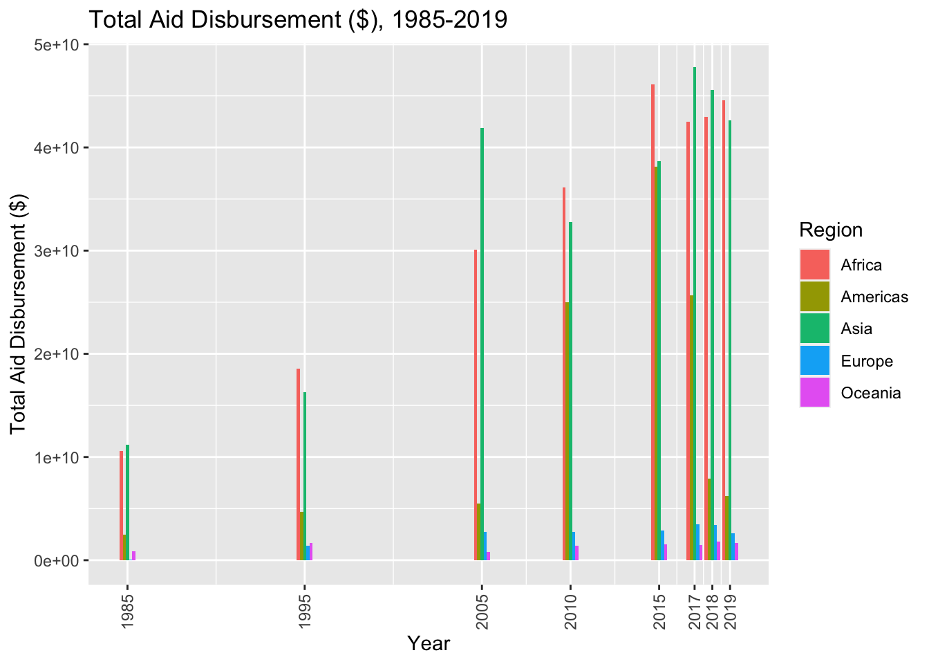
As seen from the years 1985-2019, the total disbursements sent to the five regions differ, where the regions that are dominated by economically developed countries such as Europe and Oceania saw minimal to no increase in the disbursements, whereas disbursements peak and decline for the Americas and Asia as they experience economic growth, and finally Africa which has a steady increase in disbursements. Just by the regions, we can see that Asia, Africa, and the Americas, which have the most population living in economically developing countries, receive the most aid.
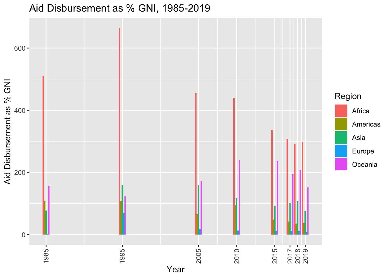
The story changes when talking about the proportion of their GNI received as ODA, where seen by the graph below Oceania, having the least population of the five regions, receives the most aid when compared to their total GNI.
So what really gets your country more aid? It certainly can’t be explained purely by what continent your country is in, so we need to look into the countries deeper and look at the quality-of-life indicators that give a more comprehensive look.
It would be obvious to say that the more people you have, the more you would need to satisfy the needs of the larger population. Therefore, just by looking at raw dollar amounts of disbursements can’t tell us the answer, similar to the amount a developed country puts to their ODA, where although the United States had \[ $ \]40.7 billion USD in net ODA in 2021 while Norway only had \[ $ \]3.7 billion, they were 0.18% and 0.93% of their GNI respectively. Therefore, looking at percentages countries received compared to their GNI will tell a more transparent story.
On the subject of populations, we can infer how urbanized and centralized a country is by looking at their urban and slum population, as a country whose population that are centered around their cities would suggest that the country’s population is deviating away from unskilled labor to work in more skilled and professional settings.
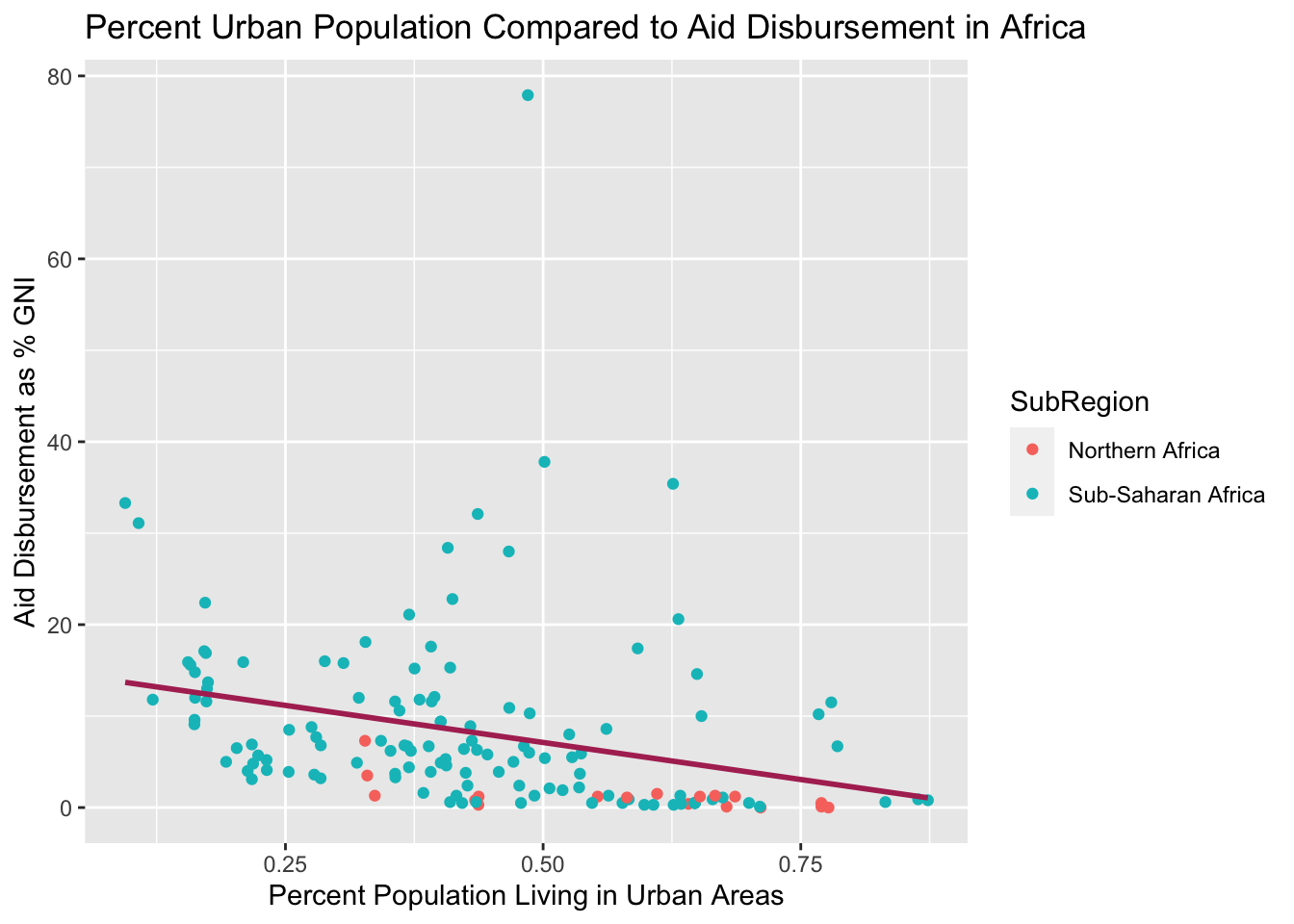
Looking at Africa, which received a steady increase of disbursements from 1985 to 2019, we can see that there is a strong negative correlation between the percent of their population living in cities and the aid their country received compared to their GNI.
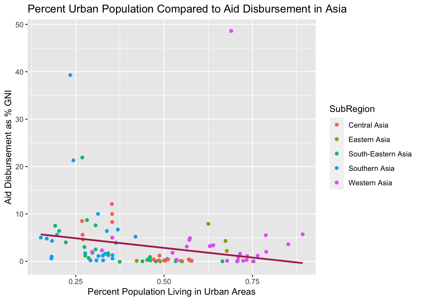
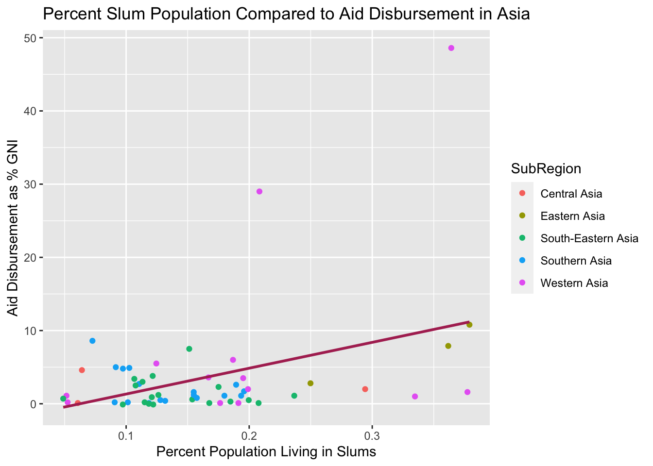
The story stays the same in Asia, where there is a clear negative trend between the percentage of the country’s population living in cities and the aid they received. Outliers may suggest the size of the country, as compared to Africa, there are more small countries, whether they are in Central and Western Asia or the island nations of Southeast Asia. Clearly the percentage of urban population tells a strong story, but what about the smaller nations where you can’t live anywhere but the city? This is where the population living in slums can fill up the missing piece.
Going back to Asia, where there are 14 countries and territories under 10,000 square miles by area compared to 8 in Africa, we now look at the disbursements the countries received when compared to the population living in slums. As depicted below, we get a better look when combining urban population and slum population as the indicator to tell whether the country is in need of aid.
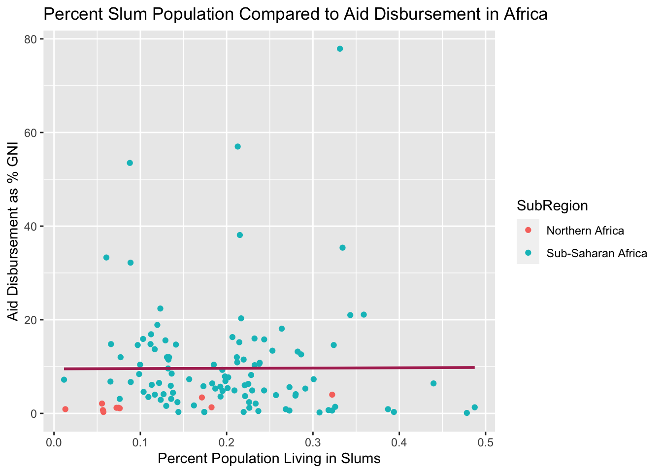
In Africa however, things are different, as there does not seem to be a high correlation between the aid the country received and the percent living in slums, although Africa has two of the five biggest slums in the world (Khayelitsha in Cape Town (South Africa) and Kibera in Nairobi (Kenya)) according to the Habitat for Humanity. This may be explained to the fact that since the African continent is less urbanized than Asia, those who do live in the cities have to resort to slums, neutralizing the high skilled labor and economy that is brought with a higher urban population to some extent. Moreover, Kenya and South Africa are more economically developed than the average Sub-Saharan African country, where according to the World Bank, with the average GNI per capita of \[ $ \]3,795 USD of a Sub-Saharan African country is less than that of South Africa and Kenya of \[ $ \]13,140 and \[ $ \]4,500 USD respectively.
Urban populations tell us a strong statement regarding the aid that they received, but something else that can portray the current state of a country is the air quality of the country, which is measured by the PM2.5 concentration, or particulate matter with a width of 2.5 microns or less, which can cause health problems as it is small enough to enter bloodstreams when inhaled. Most economically developed countries have found ways to reduce the PM2.5 concentration in their atmosphere, whether it is using different methods of generating electricity and heat or setting regulations on modes of transportation that emit these matter. On the other hand, economically developing countries can put less focus of their economy for their environmental well-being, which forces them to use cheaper sources of energy such as coal that emit higher concentrations of pollutants. We wanted to see if this was true, where we gathered air quality indexes of the cities to see if there was any correlation between air quality and the aid the country received.
Urban populations tell us a strong statement regarding the aid that they received, but something else that can portray the current state of a country is the air quality of the country, which is measured by the PM2.5 concentration, or particulate matter with a width of 2.5 microns or less, which can cause health problems as it is small enough to enter bloodstreams when inhaled. Most economically developed countries have found ways to reduce the PM2.5 concentration in their atmosphere, whether it is using different methods of generating electricity and heat or setting regulations on modes of transportation that emit these matter. On the other hand, economically developing countries can put less focus of their economy for their environmental well-being, which forces them to use cheaper sources of energy such as coal that emit higher concentrations of pollutants. We wanted to see if this was true, where we gathered air quality indexes of the cities to see if there was any correlation between air quality and the aid the country received.
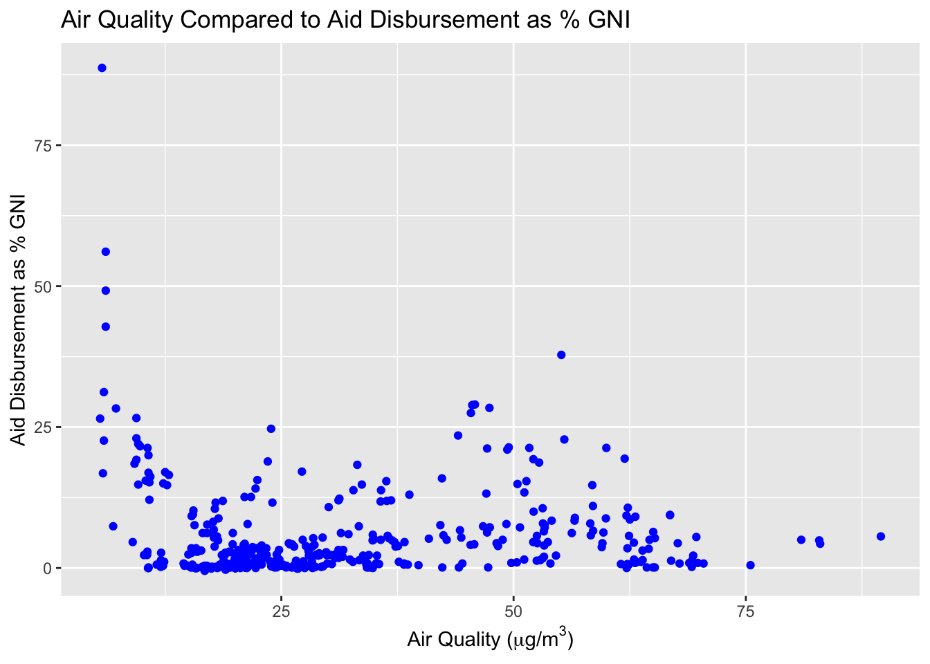
Looking at the plot above, we can see that looking at the cities around the world, there is clearly a correlation between the PM2.5 concentration and the aid the country received compared to their GNI, where cities that have passed 30 \(\mu g/m^3\) have received a higher disbursement to cities that have not.
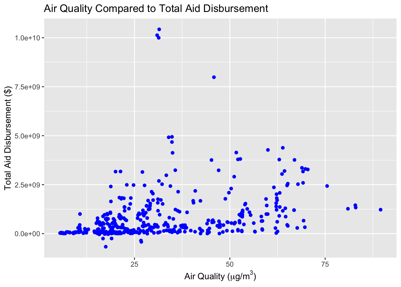
Looking at the total disbursements by the PM2.5 concentration, it seems to tell the same story where a country with more polluted cities will receive a higher disbursements outright. A reasoning behind this may be that a more polluted city may come from a city that requires more energy and transportation, meaning a higher population. Looking at the Environmental Performance Index by Yale University, we can see that three of the four worst polluted countries happen to be Bangladesh, India, and Pakistan, which have populations of 164.7 million, 1.38 billion, and 220.9 million respectively, requiring more aid due to the higher population.
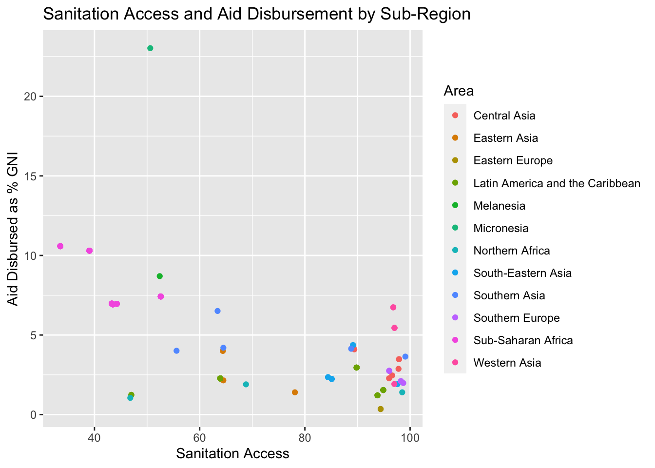
Sanitation also gives us some insight into how likely a country is to receive aid. As shown below, the countries that received the most aid relative to their GNI were those where the lowest proportion of the population had access to sanitation. While outliers do exist, even if they were removed, the downward trend in aid as a percentage of GNI would still be expected to decrease as access to sanitation increases. The relationship is even stronger when looking at improved sanitation, with the absolute value of the parameter coefficient almost doubling in value. Note that although the y-axis is labeled “Aid Disbursement,” the values are given as a percentage of GNI.
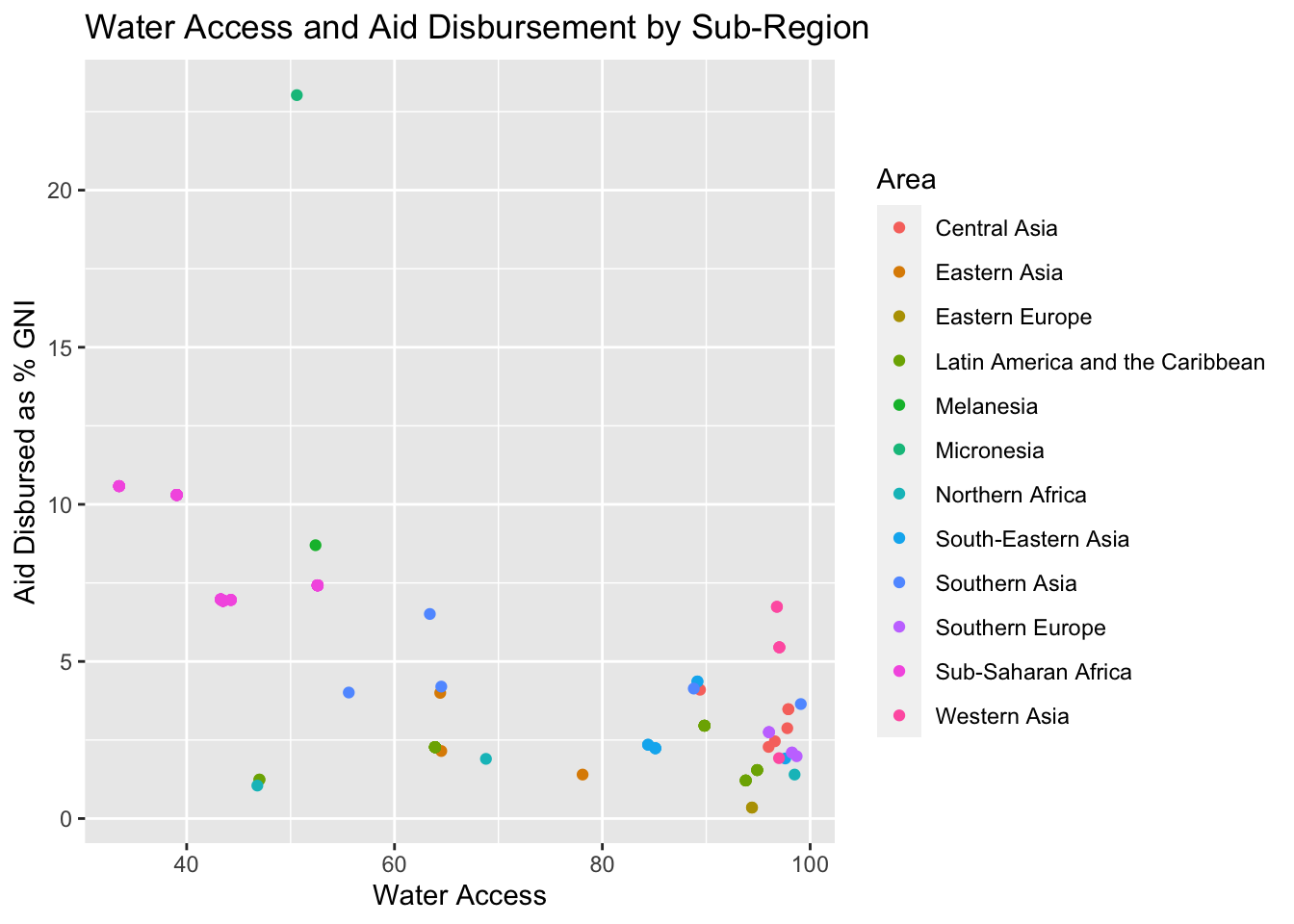
Looking at improved water access, we see a similar story, and with an even stronger negative correlation between access and aid received. Notably, the strongest correlation here exists in Africa and its subregions, however this is most likely due to the wide variety of access levels that exist in Africa compared to any of the other regions, which all have relatively high access to improved water. In the figure below, the vast majority of data points below 90% access to improved water are nations located in Africa. That this correlation holds when the rest of the world is factored in, however, indicates that there is indeed a real relationship between access to improved water and aid received. As above, note that although the y-axis is labeled “Aid Disbursement,” the values are given as a percentage of GNI.
Our goal is to shed light on which quality-of-life indicators are the most significant in predicting how much aid a region receives in a given year. We show the relationships between various standard-of-living parameters such as water quality, air quality, access to sanitation, sufficient living area, and slum population, with the amount of aid that was received by the region and subregion, taking into consideration both total aid received and amount of aid received as a percentage of a region’s GNI.. While total aid is important to consider, aid as a percentage of GNI is arguably more reliable, as it reflects a region’s GDP and is somewhat related to its size and population.
Looking at our plots, we can see that Africa received the most aid proportional to their GNI, other than Oceania. We note that while Oceania receives the most aid proportionally, it receives very little in absolute terms, due to the fact that their GNI is very low compared with other regions.
At first glance, meaning upon consideration of total aid only, we found that the most significant parameter for predicting amount of aid a region receives was air quality. Its correlation with aid was very high and the relationship between the two is significant: Regions with poor air quality received more aid, with a very high correlation. The percentage of the population living in slums and urban areas were the next two most significant predictors for amount of aid, with a positive correlation. However, looking at aid as a percentage of GNI, air quality seems insignificant. The most highly correlated parameters when considering a region’s GNI are access to sanitation/improved sanitation, improved water quality, and sufficient living area.
This makes more sense, given that access resources such as sanitation and clean water are directly related to a government’s ability to get those resources to their citizens. In other words, any number of factors can contribute to poor air quality, such as weather, pollution from neighboring countries, and even a regions natural ecosystem. Sanitation and improved water quality, on the other hand, require concrete investment in a nation’s infrastructure. It takes actual dollars and cents to filter water and to efficiently distribute it to households so that they can make use of it. We expect that this trend will continue in future years, and that countries which receive a high amount of aid relative to GNI will see higher rates of access to clean water and improved sanitation in the future, assuming that aid is invested in critical water infrastructure.
Through our analysis of the relationship between each of these variables and aid disbursement, we found interesting and promising relationships individually. However, ultimately we lacked the data and statistical power necessary to synthesize our individual results into a comprehensive model. We believe this is an important and complex topic, and that these variables along with other parameters not considered here are useful as indicators of need for aid and measures of improvement as a result of aid when considering aid disbursement at an international level.
Regional Aid Disbursement Interactive
Interactive tool for exploring and quantifying the relationship between aid disbursement (as total aid or percentage of GNI) to regional groups and possible predictors of aid received (population, urban population, slum population, air quality, access to basic services).