
library(tidyverse)
library(faraway)
library(corrplot)
library(car)
source(here::here("dataset", "load_and_clean_data.R"))
Introduction to our Data Analysis
When we first started our data analysis, as a group, we were primarily interested in humanitarian data such as population, mortality rate, air quality, water quality, and more. Understanding the interactions between these variables and how one affects the other is essentially what motivated our data analysis. As we continued on with our exploratory data analysis, we were able to narrow down the variables that we wanted to work with as initially, we had a wide range of choices for the data sets that we wanted to work with since we first took a look at all the data sets available on the UN Habitat. We also decided to include another data set – aid disbursements per country – after looking through the number of available data we could work with. We realized that we could build a model relating aid disbursements to the variables that measure quality of life from the initial sets that we were working with.
After having done several exploratory data analysis and cleaning the data through the blog posts, we decided that we would build our final model on the basis of aid disbursement, air quality, population, and several variables that measure quality of life through basic services such as sanitation access, drinking access, improved sanitation, hand washing, improved water quality, and living area.
The main relationship that we are interested in is whether or not aid disbursements have an impact on the variables that were listed above. Theoretically, aid is given to a country in order to improve its quality of life and so we are investigating whether or not the aid is actually doing its job. This leads to the main question we are interested in – What determines how much aid a country gets? Does the amount of aid, over time, correlate with improvements in a country’s quality of life (i.e. does it work?)? However, it is important to note that there are a lot of factors that one would need to control in order to understand the sole impacts of aid and how the money is being put to use since there exists various external factors that may impact it as well.
Breadth of Data Analysis
In order to better understand the primary relationship that we have proposed in our data analysis, we’ve built our final interactive tool with the consideration of the variables that we have mentioned above. Although we explore several different relationships in our exploratory data analysis, in order to better decipher and make sense of the data, we have broken down the interactive to focus on the following relationships:
- Relationship between aid disbursement and population per sub region or region.
This relationship can also be specified to look at total population, urban population, percent of urban population and percent of slum population of a region or sub region. - Aid disbursement throughout the years
This relationship is also broken down into total aid over the years and aid by % GNI over the years, and can be specified further into total aid per year, aid received by a region per year, and aid received by a sub region per year.
- Relationship between aid disbursement and air quality This relationship is also broken down into total aid and aid by % GNI plotted against air quality.
- Relationship between aid and Basic Services This plot demonstrates the relationship between these services (sanitation & drinking access, improved sanitation, hand washing, improved water, and living area) over the years, plotted against aid disbursement as a percentage of GNI and also total disbursement.
Depth of Data Analysis
To answer the questions that we have presented as the highlight of our data analysis, we take into consideration the effects that our independent variables have on the response variable that we have chosen both as a whole, and respectively (per variable). We do this to gain not only a better understanding, but also a more accurate one, of the impacts that the amount of aid has on a region and basically, its real life implications. Moreover, we also include a regression model of respective variables in our final interactive in order for those who have a deeper knowledge in statistical to understand the significance of our model and to confirm whether or not aid has an impact on each of the variables that contribute to a (sub)region’s quality of life.
Modeling and Inference
In our final interactive, as mentioned above, we have included a linear statistical regression model that describes the relationship between aid disbursement and the different variables that we have included in our final model. Based on this interactive, we identified several possible regressors which may be significant in a multivariate model:
Firstly, looking through the correlation coefficient of TOTAL aid disbursements and its relationship to all the variables that we are investigating, we find that the absolute values of the correlation coefficients for the variables (which tells us the strength of their linear relationship) we expect to have a higher correlation coefficient – measures of quality of life – to be on the lower side, with most of them being less than 0.5 with the exception of hand washing, sanitation access and air quality. On the other hand, we see that the correlation coefficient of the model with respect to variables relating to population including percentage of slum population, percentage of urban population, and slum population to be high.
Slum population has a correlation coefficient of 0.48, demonstrates some correlation between slum population and aid disbursement. To better understand this relationship, we investigate the relationship between aid disbursement and the slum population of a region as a percentage of the total population since population can be relative, and total slum population displays collinearity with the variable total population.
Percentage of slum population has a correlation coefficient of 0.63, which is quite high and is intuitive since we expect that a region with a higher percentage of slum population (i.e. population in poverty) to receive more aid. Particularly, we see that regions in Africa have the greatest values in the percentage of slum population and are among the highest in terms of receiving aid.
Percentage of urban population has a correlation coefficient of -0.87 which signifies that regions with higher urban proportions will generally receive less aid and intuitively, this makes sense as a larger urban population proportion would imply that the population has better access to basic necessities and are living a better quality of life.
As we can see in the graph below, total population is highly correlated with both slum population and urban population, and thus all three variables should not both be included in a multiple regression model. However, the percentage slum and percentage urban variables are much less highly correlated with total population or with one another, so these are both good possible regressors to use. Additionally, percent slum population and percent urban population are both highly corrrelated with net disbursements as total US $ to regional groups.
pop_cor1=cor(joined_model %>%
              filter(DisbursementCategory == "Total",
                     Grouping == "Region",
                     !is.na(PercSlum),
                     !is.na(PercUrban)) %>%
              select(TotalPop, SlumPop, UrbanPop, PercSlum, PercUrban, NetDisbursements))
corrplot(pop_cor1,method="number")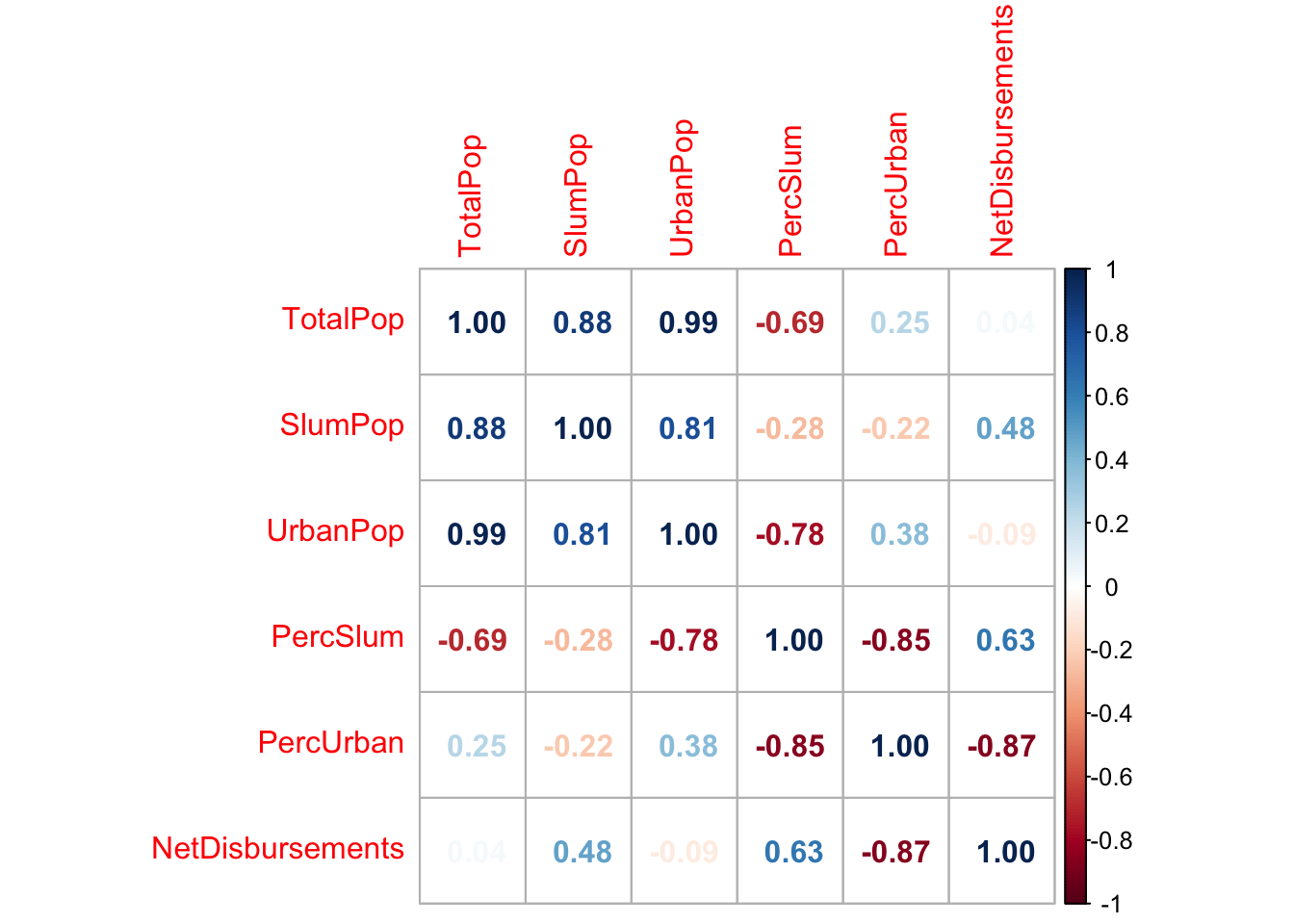
Conversely, we see that if we investigate the linear relationships between aid disbursement as a PERCENTAGE of GNI and these variables, we obtain results that differ from the initial total aid disbursement data. We actually get a higher correlation coefficient for many variables, including urban population, total population, living area, improved water quality, hand washing, improved sanitation, and sanitation access. We see a much higher correlation between total population and aid disbursed as a % of regional GNI. The correlation coefficient for percentage urban population is almost identical, and we again see a negative relationship between percentage urban population and aid received. We see an even stronger association between percentage slum population and aid recieved, strengthening the evidence that percent slum population is a good predictor of aid disbursement. For this variable, we actually see that a higher percentage of aid disbursement with respect to the GNI of a region correlates to higher values in measurement indexes of quality of life. For example, we see that the population sees greater access to sanitation and better qualities of water and sanitation, which is what we expected.
From this, we again see that percentages of populations (urban and slum) are actually better predictors in comparison to just the total population of urban and slum in a region or sub region to determine which country gets more aid. This is because the total urban population and total slum population are collinear with total population.
pop_cor2=cor(joined_model %>%
              filter(DisbursementCategory == "PercGNI",
                     Grouping == "Region",
                     !is.na(PercSlum),
                     !is.na(PercUrban)) %>%
              select(TotalPop, SlumPop, UrbanPop, PercSlum, PercUrban, NetDisbursements))
corrplot(pop_cor2,method="number")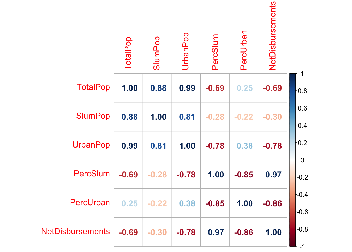
The access to basic services and air quality variables are much more limited in terms of available years than the population data. However, this does not discount the usefulness of these variables in our analysis. In the graph below, we see a strong linear relationship between air quality and net disbursements, as well as improved sanitation, improved water, drinking access, and sanitation access, with some outliers.
scatter_data <- joined_model %>%
filter(DisbursementCategory == "Total",
Grouping == "Region")
scatterplotMatrix(~NetDisbursements + AirQuality + improved_water + drinking_access + improved_san + san_access + hand_washing + living_area, data = scatter_data)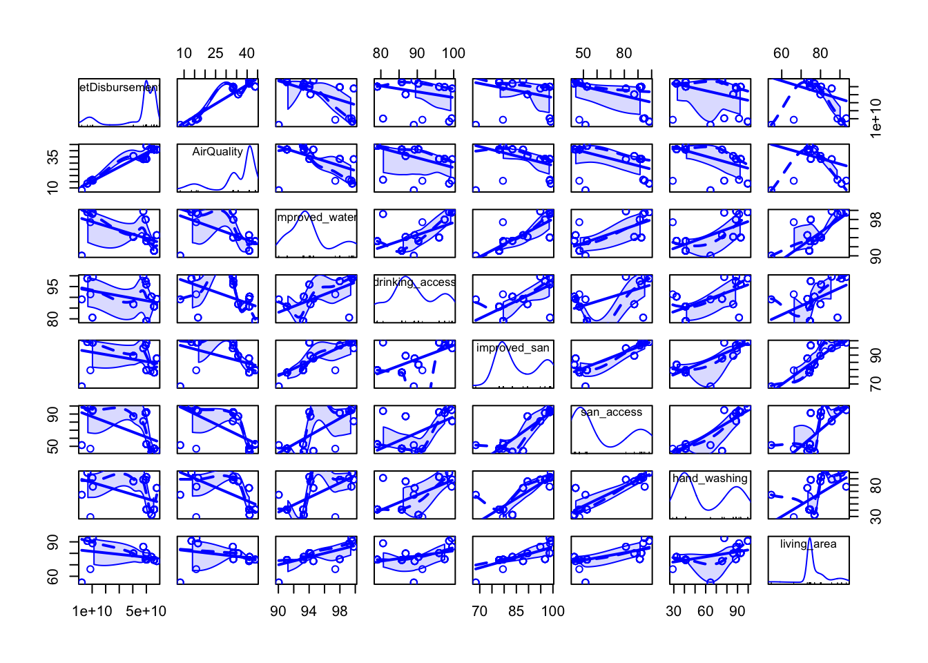 It is clear from this plot and the correlation matrix below, however, that the access to basic services dataset is highly multicollinear, so we must be careful when considering which predictors to add to the overall model. Air quality remains highly significant in its relationship with net disbursements, and both sanitation access and improved water should be considered as well.
cor3=cor(joined_model %>%
              filter(DisbursementCategory == "Total",
                     Grouping == "Region",
                     !is.na(AirQuality),
                     !is.na(improved_water)) %>%
              select(AirQuality, improved_water, drinking_access, improved_san, san_access, hand_washing, living_area, NetDisbursements))
corrplot(cor3,method="number")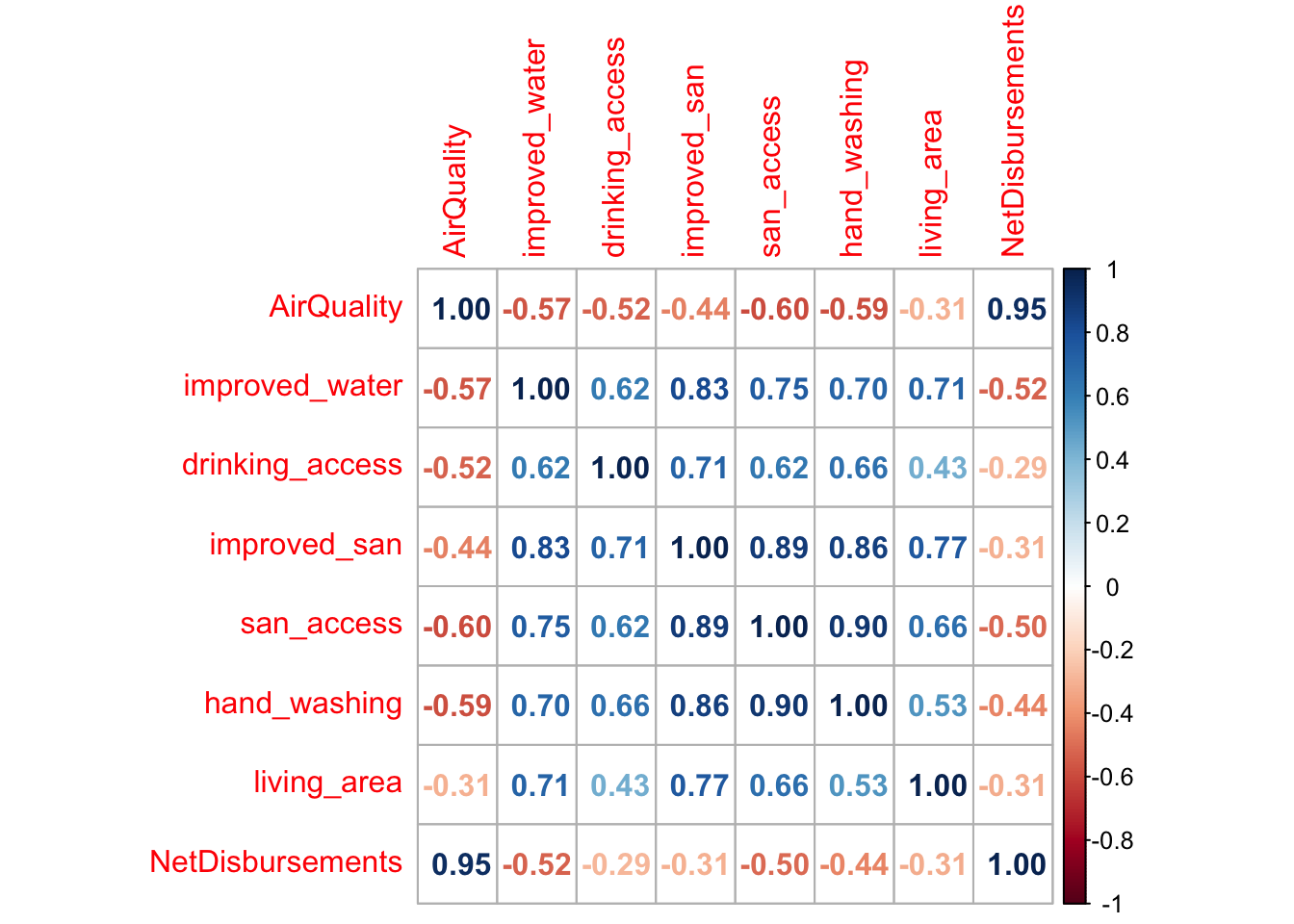
Our proposed linear model for predicting total regional aid disbursement, with individual regressors selected through our interactive tool and the analysis above, is:
mod_reg_total <- lm(NetDisbursements ~ Area + TotalPop + PercUrban + PercSlum + improved_water + san_access - 1,
          data = joined_model %>%
            filter(DisbursementCategory == "Total",
                   Grouping == "Region"))
summary(mod_reg_total)
##
## Call:
## lm(formula = NetDisbursements ~ Area + TotalPop + PercUrban +
## PercSlum + improved_water + san_access - 1, data = joined_model %>%
## filter(DisbursementCategory == "Total", Grouping == "Region"))
##
## Residuals:
## Min 1Q Median 3Q Max
## -0.001087 0.000000 0.000000 0.000000 0.003121
##
## Coefficients: (2 not defined because of singularities)
## Estimate Std. Error t value Pr(>|t|)
## AreaAfrica -1.199e+12 3.176e-02 -3.775e+13 <2e-16 ***
## AreaAmericas -1.559e+12 3.866e-02 -4.032e+13 <2e-16 ***
## AreaAsia 2.008e+12 4.698e-02 4.274e+13 <2e-16 ***
## TotalPop -1.181e+03 2.827e-11 -4.178e+13 <2e-16 ***
## PercUrban 7.037e+12 1.691e-01 4.162e+13 <2e-16 ***
## PercSlum -2.236e+12 5.568e-02 -4.017e+13 <2e-16 ***
## improved_water NA NA NA NA
## san_access NA NA NA NA
## ---
## Signif. codes: 0 '***' 0.001 '**' 0.01 '*' 0.05 '.' 0.1 ' ' 1
##
## Residual standard error: 0.0007368 on 35 degrees of freedom
## (104 observations deleted due to missingness)
## Multiple R-squared: 1, Adjusted R-squared: 1
## F-statistic: 1.896e+28 on 6 and 35 DF, p-value: < 2.2e-16For subregional data and total aid disbursement:
mod_sub_total <- lm(NetDisbursements ~ Area + TotalPop + PercUrban + PercSlum + improved_water + san_access - 1,
          data = joined_model %>%
            filter(DisbursementCategory == "Total",
                   Grouping == "SubRegion"))
summary(mod_sub_total)
##
## Call:
## lm(formula = NetDisbursements ~ Area + TotalPop + PercUrban +
## PercSlum + improved_water + san_access - 1, data = joined_model %>%
## filter(DisbursementCategory == "Total", Grouping == "SubRegion"))
##
## Residuals:
## Min 1Q Median 3Q Max
## -0.0002607 0.0000000 0.0000000 0.0000000 0.0005545
##
## Coefficients:
## Estimate Std. Error t value Pr(>|t|)
## AreaEastern Asia 7.264e+11 8.640e-03 8.407e+13 <2e-16
## AreaLatin America and the Caribbean 1.165e+12 1.192e-02 9.768e+13 <2e-16
## AreaNorthern Africa 1.196e+12 1.211e-02 9.874e+13 <2e-16
## AreaSouth-Eastern Asia 9.548e+11 1.004e-02 9.513e+13 <2e-16
## AreaSouthern Asia 6.134e+11 8.100e-03 7.574e+13 <2e-16
## AreaSub-Saharan Africa 7.984e+11 8.433e-03 9.468e+13 <2e-16
## AreaWestern Asia 1.216e+12 1.219e-02 9.970e+13 <2e-16
## TotalPop 3.147e+02 2.975e-12 1.058e+14 <2e-16
## PercUrban -5.575e+11 8.962e-03 -6.221e+13 <2e-16
## PercSlum 3.791e+11 8.435e-03 4.495e+13 <2e-16
## improved_water -1.100e+10 1.277e-04 -8.616e+13 <2e-16
## san_access 1.598e+09 2.257e-05 7.083e+13 <2e-16
##
## AreaEastern Asia ***
## AreaLatin America and the Caribbean ***
## AreaNorthern Africa ***
## AreaSouth-Eastern Asia ***
## AreaSouthern Asia ***
## AreaSub-Saharan Africa ***
## AreaWestern Asia ***
## TotalPop ***
## PercUrban ***
## PercSlum ***
## improved_water ***
## san_access ***
## ---
## Signif. codes: 0 '***' 0.001 '**' 0.01 '*' 0.05 '.' 0.1 ' ' 1
##
## Residual standard error: 0.0001482 on 35 degrees of freedom
## (146 observations deleted due to missingness)
## Multiple R-squared: 1, Adjusted R-squared: 1
## F-statistic: 6.764e+28 on 12 and 35 DF, p-value: < 2.2e-16We see extremely significant p values for all the regression coefficients in the regional model, as well as an adjusted \(R^2\) value of 1. Clearly this is unrealistic, because our model is an extreme over-simplification of a complicated dataset, and it would be unwise to believe that this model accounts for 100% of the variation in aid dispersement. The significance of our model likely is a result of over-fitting; we simply did not have enough data available and had to make generalizations within the data we did have due to missingness and regional grouping. The lack of data can be seen clearly in the total degrees of freedom (35), and the fact that improved water and sanitation access have too little data to be incorporated in the regional model.
For the subregional model, the lack of data and generalizations within analysis have again led to overfitting of our model, and with more available data we could generate a more trustworthy model. We see a negative coefficient for percent urban population and improved water, as we expected, and a postive coefficient for percent slum population as expected. However, the positive relationship between sanitation access and aid disbursement is not what we would have predicted. For both of these models, air quality had to be excluded due to lack of data, although with a better dataset air quality has the potential to be a good predictor of aid disbursement.
Although there is a strong lack of data in our model and a clear case of overfitting (extremely small residual standard error, very few total df of the model, unrealistic adjusted \(R^2\)), there is a likelihood that our analysis does demonstrate a true positive relationship between percentage slum population in an area and aid dispersal to that area, and it is also highly likely that metrics like percent urban population and access to improved drinking water would be indicators of regions where less aid disbursement is necessary. With more time, more availability of data, and more exploration of methods to account for a complex relationship like this one, we could determine with greater certainty the factors which make a region, subregion, or country likely to receive aid.
It is evident that the model is still a bit flawed in terms of helping us arrive at a decided and final conclusion for our findings. However, this is consistent with the need to consider other external factors that may impact the model that we may have not accounted for. In addition to this, our model also presents uncertainties in the type of model that we have chosen. Exploring different types of models, such as log, exponential, or others, may more accurately characterize the true relationship between these variables. Due to the limitations of our model and data, we cannot conclude that increased aid directly results in improved quality of life based on this analysis. However, we can still say that there is evidence to aid being put to work and is really making a change in the way people live their lives in certain parts of the world.
Flaws and Limitations
One of the major limitations of our analysis is data availability. Joining multiple datasets together results in many missing values, due to inconsistency between the years for which data is available in each dataset. The decision to analyze the data on a regional level helps increase the available data for predictions within each region, but results in a loss of specificity of the results. Taking regional sums and averages allows us greater analysis options based on the data we have, but we must recognize that these generalizations will not always translate to reality. In hindsight, although regional analysis provided much better data visualization and was helpful in creating our interactive, it may be a major cause of the overfitting in our models.
As mentioned in the section above, we see that the statistical models don’t support a solid conclusion about the relationship between our available regressors and regional aid disbursement. It should be noted that the model does not take into consideration all the external factors that may impact the relationship between a country’s aid disbursement and the variables that we focused on. Hence, we should be taking the results of our exploratory data analysis keeping in mind the assumption that the displayed relationship only tells a part of the story, and not the whole. To better understand the primary relationship in question, examples of data sets that may help would be a measurement of aid corruption, breakdown of where the aid goes, and more. With these data, we can really track the impact of the amount of aid given and the results that are yielded to really see whether or not aid is impacting or acting the way it is intended to.